Introduction
Over the next few lessons we will cover CSS Grid and make page layouts much easier. First we’ll take a quick look back at Flexbox (remember Flexbox!?) and then learn about Grid.
The following lessons will show you how to create a grid, position grid items and use some advanced properties. Then we will take a deeper look between Flexbox and Grid. Ultimately we are working towards building a dashboard project using Grid.
Lesson overview
This section contains a general overview of topics that you will learn in this lesson.
- Compare the basics between Flexbox and Grid.
- Describe a situation for using Grid over Flexbox.
A look back at flex
In the Foundations course you learned a lot about Flexbox. If you’ve been using Flex here and there along the way, this section will be a quick refresher before we get into Grid. If you’re completely lost on Flex, then it might be helpful to go back through the Flex lessons again to get up to speed.
The Flex lessons covered positioning items along the two flex axes (main and cross) and how to set their flex alignment. You also learned how to make your flex items grow, shrink or change their size. This is the real beauty of Flexbox as items can, well, “flex” to stretch out or shrink down.
You’ll remember you can line up a nice row of flex items like this:
See the Pen Single Row | CSS Flexbox by TheOdinProject (@TheOdinProjectExamples) on CodePen.
Or a column like this:
See the Pen Single Column | CSS Flexbox by TheOdinProject (@TheOdinProjectExamples) on CodePen.
For one-dimensional layouts, Flex offers a convenient tool without having to rely on floats or CSS hacks to align your items properly.
For two-dimensional layouts, you learned a little bit about flex-wrap, which allows you to take your flex items and wrap them to the next line. This can be done with either a row that wraps to another row, or a column that wraps to another column.
Remember how much fun you had solving the card layout in this exercise?
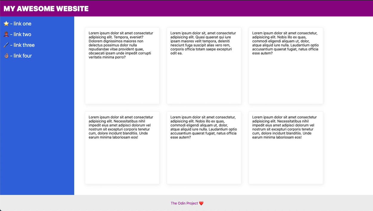
We know that was a frustrating one, but it’s part of the point. While Flexbox allows you to build a layout of rows and columns together, it isn’t always easy.
But setting up a two-dimensional layout of cards would be much easier using CSS Grid:
See the Pen 2D Layout | CSS Grid by TheOdinProject (@TheOdinProjectExamples) on CodePen.
What is grid?
Although Grid is a newer module to CSS, this layout tool has long been in development. Fun fact, CSS co-creator Dr. Bert Bos (no relation to Wes Bos) started working on this layout model in 1996. The idea was inspired by the use of grid-like layouts in other forms of media like newspapers and magazines. After years of thorough demonstrations and development, CSS Grid was finally introduced to all major browsers in 2017.
As shown above, Grid is often praised for easy placement of items in a two-dimensional layout. But Grid can be used for one-dimensional layouts too. One advantage for developers is if they start off with only one row of items, they can add additional rows later.
You will notice a lot of similarities between Flex and Grid. Both use parent containers with child items. They have similar property names for alignment and positioning. But you will also come across a lot of differences between the two and opinions on how each module should be used. For example, if you’ve been struggling to get your Flex items to all match evenly in size, Grid can make this type of layout much easier.
When reviewing older resources, keep in mind that differences between Flex and Grid can also change as these modules get updated. One of the big highlights for CSS Grid was the use of the gap property, which we will cover in the next lesson. This used to only be available to Grid, but is now supported with Flex too.
While some people thought CSS Grid was here to replace Flexbox, you will learn by the end of these lessons that Grid is just another tool for the bag. In fact, not only do each of these modules have their own use cases, but you will also find it helpful to pair Flex and Grid together. But we’ll be covering all of that in the concluding lesson. First you will learn how to actually make a grid!
Assignment
- Surprise! No assignment! You’ll be learning a lot more throughout the coming lessons so keep going.
Knowledge check
The following questions are an opportunity to reflect on key topics in this lesson. If you can’t answer a question, click on it to review the material, but keep in mind you are not expected to memorize or master this knowledge.