Introduction
Let’s look a little closer at what actually happened when you put flex: 1 on those flex items in the last lesson.
Lesson overview
This section contains a general overview of topics that you will learn in this lesson.
- You’ll learn the 3 properties that are defined by the
flexshorthand, and how to use them individually.
The flex shorthand
The flex declaration is actually a shorthand for 3 properties that you can set on a flex item. These properties affect how flex items size themselves within their container. You’ve seen some shorthand properties before, but we haven’t officially defined them yet.
Shorthand properties are CSS properties that let you set the values of multiple other CSS properties simultaneously. Using a shorthand property, you can write more concise (and often more readable) stylesheets, saving time and energy.
Source: Shorthand properties on MDN
In this case, flex is actually a shorthand for flex-grow, flex-shrink and flex-basis.
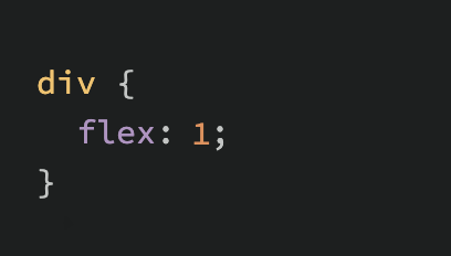
In the above screenshot, flex: 1 equates to: flex-grow: 1, flex-shrink: 1, flex-basis: 0.
Flex-grow
flex-grow expects a single number as its value, and that number is used as the flex-item’s “growth factor”. When we applied flex: 1 to every div inside our container, we were telling every div to grow the same amount. The result of this is that every div ends up the exact same size. If we instead add flex: 2 to just one of the divs, then that div would grow to 2x the size of the others.
In the following example the flex shorthand has values for flex-shrink and flex-basis specified with their default values.
See the Pen flex-grow example by TheOdinProject (@TheOdinProjectExamples) on CodePen.
Flex-shrink
flex-shrink is similar to flex-grow, but sets the “shrink factor” of a flex item. flex-shrink only ends up being applied if the size of all flex items is larger than their parent container. For example, if our 3 divs from above had a width declaration like: width: 100px, and .flex-container was smaller than 300px, our divs would have to shrink to fit.
The default shrink factor is flex-shrink: 1, which means all items will shrink evenly. If you do not want an item to shrink then you can specify flex-shrink: 0;. You can also specify higher numbers to make certain items shrink at a higher rate than normal.
Here’s an example. Note that we’ve also changed the flex-basis for reasons that will be explained shortly. If you shrink your browser window you’ll notice that .two never gets smaller than the given width of 250px, even though the flex-grow rule would otherwise specify that each element should be equally sized.
See the Pen flex-shrink example by TheOdinProject (@TheOdinProjectExamples) on CodePen.
An important implication to notice here is that when you specify flex-grow or flex-shrink, flex items do not necessarily respect your given values for width. In the above example, all 3 divs are given a width of 250px, but when their parent is big enough, they grow to fill it. Likewise, when the parent is too small, the default behavior is for them to shrink to fit. This is not a bug, but it could be confusing behavior if you aren’t expecting it.
Flex-basis
flex-basis sets the initial size of a flex item, so any sort of flex-growing or flex-shrinking starts from that baseline size. The shorthand value defaults to flex-basis: 0%. The reason we had to change it to auto in the flex-shrink example is that with the basis set to 0, those items would ignore the item’s width, and everything would shrink evenly. Using auto as a flex-basis tells the item to check for a width declaration (width: 250px).
Important note about flex-basis
There is a difference between the default value of flex-basis and the way the flex shorthand defines it if no flex-basis is given. The actual default value for flex-basis is auto, but when you specify flex: 1 on an element, it interprets that as flex: 1 1 0. If you want to only adjust an item’s flex-grow you can do so directly, without the shorthand. Or you can be more verbose and use the full 3 value shorthand flex: 1 1 auto, which is also equivalent to using flex: auto.
What is flex auto?
If you noticed, we mentioned a new flex shorthand flex: auto in the previous note. However we didn’t fully introduce it. flex: auto is one of the shorthands of flex. When auto is defined as a flex keyword it is equivalent to the values of flex-grow: 1, flex-shrink: 1 and flex-basis: auto or to flex: 1 1 auto using the flex shorthand. Note that flex: auto is not the default value when using the flex shorthand despite the name being “auto” which may be slightly confusing at first. You will encounter and learn more about flex: auto and its potential use-cases when reading through the assignment section.
In practice
In practice you will likely not be using complex values for flex-grow, flex-shrink or flex-basis. Generally, you’re most likely to use declarations like flex: 1; to make divs grow evenly and flex-shrink: 0 to keep certain divs from shrinking.
It is possible to get fancy, and set up layouts where some columns relate to each other in a specific ratio, so it’s useful to know that you can use other values, but those are relatively rare.
Assignment
- Read W3C’s “7.1.1 Basic Values of ‘flex’” to understand the basic values of common flex shorthand values.
- MDN’s documentation on flex summarizes the entire flex shorthand values, as well as introduces some new syntax that hasn’t been covered in the previous article.
Knowledge check
The following questions are an opportunity to reflect on key topics in this lesson. If you can’t answer a question, click on it to review the material, but keep in mind you are not expected to memorize or master this knowledge.