Introduction
As useful as <div> and <span> elements can be as generic containers, they’re not always the most a11y friendly elements to use. While it may be tempting or easier to just use them for everything, from containers to interactive areas, you should not only check whether there is a more appropriate element to use in certain situations, but also whether you’re using an element correctly.
Lesson overview
This section contains a general overview of topics that you will learn in this lesson.
- Explain why semantic HTML is important for accessibility.
- Name the seven HTML elements that define landmarks on a page.
The importance of semantics
In terms of web accessibility, using semantic HTML is important because it provides meaning and context. Some elements have a semantic meaning, but don’t really provide any context when announced by assistive technologies, such as the <p> element. Then there are elements that have a semantic meaning and are announced with some sort of context to help users perceive or operate them, like a <button>.
The <div> and <span> elements, most likely two of the more common elements you use, are semantically neutral. That is, they themselves have no semantic meaning and provide no context on their own to assistive technologies, which can make it more difficult for users of such technologies to perceive, operate, and understand them. Don’t let this lack of semantics and context make you feel like you can never use a <div> or <span> ever again, though. They still have their uses as generic containers, such as for layouts or for generic text.
Okay, let’s look at an actual example to help better understand this whole semantics and context thing. Think of any project you may have completed so far that required a user to click on something: Rock, Paper, Scissors; Calculator; Tic-Tac-Toe. If you used <div> or <span> elements for any clickable areas, things most likely worked as intended for you. For example, perhaps you had something similar to the HTML below for your Rock, Paper, Scissors UI back in Foundations:
<!-- These are buttons... right? -->
<div class="button-container">
  <div class="rock">Rock</div>
  <div class="paper">Paper</div>
  <div class="scissors">Scissors</div>
</div>
A sighted user would most likely have no trouble playing the game if the elements looked like something to interact with. A screen reader user, however, would have no idea what any of these elements mean. The screen reader would announce the text contents of the element (“Rock”, “Paper”, or “Scissors”), and the user might think it’s just plain text on the page and move on. There’s no context to tell the user that they’re supposed to, or that they even can, interact with these elements.
This issue can be easily fixed by using semantic HTML:
<!-- Okay, these are *definitely* buttons -->
<div class="button-container">
  <button class="rock">Rock</button>
  <button class="paper">Paper</button>
  <button class="scissors">Scissors</button>
</div>
Because the <button> element has a semantic meaning and provides context, a screen reader would announce the text content as well as the role of the element: “Rock, button”.
Using semantic HTML correctly
When it comes to using semantic HTML correctly, you want to think about what your intent for users is and what context you want (or need) to provide to them. This can vary depending on the situation, but there are some things you should absolutely be checking for moving forward:
- If a user is meant to click something, whether it’s an actual button or not, you will usually want to use a
<button>element. This will let the user know that they can interact with the element by clicking on it. - If you want to provide some sort of tabular data to a user, use a
<table>element along with the elements related to it. This will allow a user to more easily navigate and understand the data being presented. -
When you use an input element, you should always create a relationship between it and a
<label>element. A<label>provides context for what an input actually means to assistive technologies, announcing the label contents each time the input is announced. Not only that, but a proper<label>increases the clickable area of the input itself, which is useful for users who have trouble clicking on smaller items. There are two ways you can create this relationship:<!-- Useful when you need the input itself to have an ID --> <label for="name">Name</label> <input type="text" id="name"> <!-- Look, Ma, no ID! --> <label> Name <input type="text"> </label> - Continuing with inputs, you should always use the
typethat makes the most sense for its intended use.type="text"makes more sense for a name or address field, whiletype="email"ortype="tel"would of course make more sense for an e-mail or telephone field, respectively. For certain devices, using the correcttypemay show only the required or additional characters on the keyboard. Atype="tel"input, for example, might make it much easier for users to fill out their phone number by providing larger, numerical-only keys on mobile or tablet devices. - When you want to present a list of some sort to a user, you should use the appropriate list element (
<ol>,<ul>, or<dl>) and their related list item elements. This will not only let the user know when they are entering or exiting a list, but also how many items are in the list.
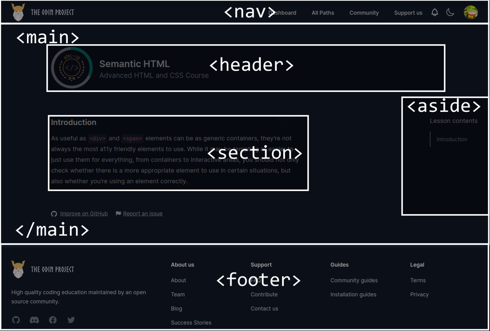
Headings and landmarks
Headings are the <h1> through <h6> elements, and like the name implies, these elements act as headings to sections of a page. Landmarks, on the other hand, are HTML elements that act as regions of a page. There are seven native HTML elements that define these landmark regions:
<aside><footer><form><header><main><nav><section>
As an example, consider the following image which shows how this lesson in particular uses semantic HTML for the different areas in the page. If you want to examine the page in more detail, feel free to use the developer tools to do so.
By properly using landmarks and headings, you provide users of assistive technologies a more operable and understandable page: not only can screen reader users navigate a page via landmarks and headings by using navigation keyboard commands (or opening a menu in their screen reader), but these elements also have their roles announced to provide additional context.
If you were to use only <div> elements to act as these landmarks and headings, maybe adding in some CSS to visually style them, then a screen reader user would have to go through the entire page just to get to a specific section, and they may not be able to actually tell what is a heading or a landmark on the page.
Assignment
-
The best way to understand how screen readers work is to use one! Take some time to explore relevant guides/docs and play around! As we introduce you to more accessibility concepts and features, experiencing some of them firsthand with a screen reader can be invaluable and really help you appreciate accessibility. You may even find yourself changing the way you build sites!
There are many screen readers around, some free and some paid, but what screen reader(s) you’ll have access to will depend on your OS (there will be slight differences in features/controls between them, but they’re by and large the same):
- Read How screen readers navigate data tables to see a great example of just how much context a proper
<table>element provides. - Watch Introduction to accessible tables and a screen reader demo to see how a screen reader announces a table.
- Watch Why headings and landmarks are so important to see how a screen reader interacts with the heading and landmark elements.
Knowledge check
The following questions are an opportunity to reflect on key topics in this lesson. If you can’t answer a question, click on it to review the material, but keep in mind you are not expected to memorize or master this knowledge.