Introduction
So far everything we’ve touched with flexbox has used the rule flex: 1 on all flex items, which makes the items grow or shrink equally to fill all of the available space. Very often, however, this is not the desired effect. Flex is also very useful for arranging items that have a specific size.
Lesson overview
This section contains a general overview of topics that you will learn in this lesson.
- You’ll learn how to align items inside a flex container both vertically and horizontally.
Alignment
Let’s look at an example.
See the Pen flex-alignment example by TheOdinProject (@TheOdinProjectExamples) on CodePen.
You should be able to predict what happens if you put flex: 1 on the .item by now. Give it a shot before we move on!
Adding flex: 1 to .item makes each of the items grow to fill the available space, but what if we wanted them to stay the same width, but distribute themselves differently inside the container? We can do this!
Remove flex: 1 from .item and add justify-content: space-between to .container. Doing so should give you something like this:
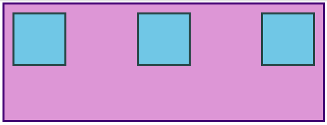
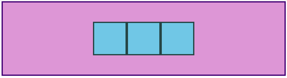
justify-content aligns items across the main axis. There are a few values that you can use here. You’ll learn the rest of them in the reading assignments, but for now try changing it to center, which should center the boxes along the main axis.
To change the placement of items along the cross axis use align-items. Try getting the boxes to the center of the container by adding align-items: center to .container. The desired result looks like this:
Because justify-content and align-items are based on the main and cross axis of your container, their behavior changes when you change the flex-direction of a flex-container. For example, when you change flex-direction to column, justify-content aligns vertically and align-items aligns horizontally. The most common behavior, however, is the default, i.e. justify-content aligns items horizontally (because the main axis defaults to horizontal), and align-items aligns them vertically. One of the biggest sticking points that beginners have with flexbox is confusion when this behavior changes.
Gap
One very useful feature of flex is the gap property. Setting gap on a flex container adds a specified space between flex items, similar to adding a margin to the items themselves. gap is a new property so it doesn’t show up in many resources yet, but it works reliably in all modern browsers, so it is safe to use and very handy! Adding gap: 8px to the centered example above produces the result below.
See the Pen flex-alignment example by TheOdinProject (@TheOdinProjectExamples) on CodePen.
There’s more for you to learn in the reading below, but at this point you can surely see how immensely useful flexbox is. With just the properties we’ve already covered, you could already put together some impressive layouts!
Take your time going through the reading. There will be some review of the items we’ve already covered here, but it goes into more depth and touches on a few things that haven’t been mentioned yet. Don’t stress too much about trying to memorize every little detail yet; just code along with the examples and do your best to internalize everything that is possible with flexbox. You’ll have to reach for these resources again once you get to the practice exercises, but that’s perfectly acceptable. The more you use this stuff the better it will stick in your mind… and you will be using it constantly. Have fun!
Assignment
- This beautiful Interactive Guide to Flexbox covers everything you need to know. It will help reinforce concepts we’ve already touched on with some really fun and creative examples. Spend some time here, some of it should be review at this point, but the foundations here are important!
- Typical use cases of Flexbox is an MDN article that covers some more practical tips. Don’t skip the interactive sections! Playing around with this stuff is how you learn it!
- The CSS Tricks “Guide to Flexbox” is a classic. The images and examples are super helpful. It would be a good idea to review parts 1-3 and part 5 (don’t worry about the media query parts, we will cover them later in the course) and then bookmark it as a great cheat sheet for future reference (keep it handy for the practice exercises).
- Go back to our CSS exercises repository and navigate to the
flexdirectory. Review each README file prior to completing the following exercises in order:01-flex-center02-flex-header03-flex-header-204-flex-information05-flex-modal06-flex-layout07-flex-layout-2
Note: Solutions for these exercises can be found in the
solutionfolder of each exercise.
Knowledge check
This section contains questions for you to check your understanding of this lesson on your own. If you’re having trouble answering a question, click it and review the material it links to.
Additional resources
This section contains helpful links to related content. It isn’t required, so consider it supplemental.
- Flexbox Froggy is a funny little game for practicing moving things around with flexbox.
- Flexbox Zombies is another gamified take on flexbox. Free, but requires an account.
- The Basic Concepts of Flexbox article on MDN is another good starting point. There are helpful examples and interactive sections.
- Aligning Items in a Flex Container goes into more depth on the topic of axes and
align-itemsvsjustify-content. - This Flexbox Tutorial from freecodecamp is another decent resource.
- Flexbox Crash Course is a nice resource by Traversy Media.
- For more interactive demos, try the Scrim on the
justify-contentproperty and the Scrim on thealign-itemsproperty. Note that these Scrims require logging into Scrimba in order to view.